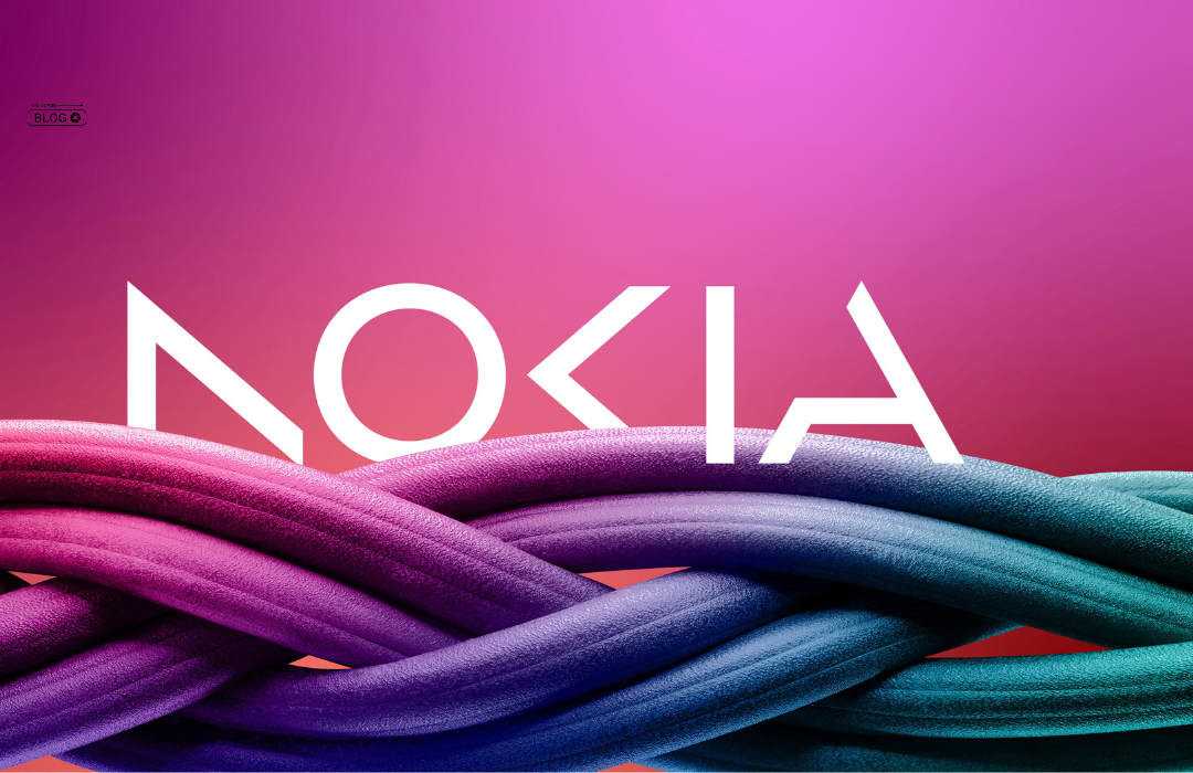
Nokia, the Finnish multinational telecommunications company, has recently announced a change in its iconic logo. Nokia’s New Logo Signals Company’s Commitment to Innovation and Connectivity. This change marks the start of a new era for the company, as it repositions itself to remain relevant in a rapidly changing technology landscape.
The “Nokia Wave”: A Symbol of Innovation and Connectivity
The new logo features a simple, all-caps font with a softer, rounded typeface. Nokia has retained the signature blue color, but updated it with a new shade that is more vibrant and modern. The logo also includes a new symbol, known as the “Nokia wave,” which is a series of interlocking arcs that represent connectivity and communication.
The Nokia wave symbol is an important element of the new logo, as it represents the company’s commitment to innovation and connectivity.
The symbol also nods to Nokia’s heritage, reminiscent of the classic Nokia ringtone, which was one of the most recognizable sounds of the early mobile phone era.
Nokia’s Shift Towards a Customer-Centric Approach
According to Nokia, the new logo represents a shift towards a more customer-centric approach, as the company seeks to better understand and meet the needs of its customers.
The tagline that accompanies the new logo, “Connecting People,” reflects this.
Nokia’s Focus on 5G, Cloud, Enterprise, and IoT
Nokia’s new logo accompanies the company’s recent strategy shift towards 5G, cloud, enterprise, and IoT. The change reflects Nokia’s effort to stay relevant in a rapidly changing technology landscape. By focusing on these areas, Nokia aims to become a leading provider of digital infrastructure and services.
Nokia positions itself as a modern, innovative company focused on connectivity and communication with its new logo, reflecting its new strategy.
It is a bold move that signals the company’s intention to remain a major player in the technology industry for years to come.
The change in Nokia’s logo is a significant moment for the company, as it marks the start of a new era.
The new logo is a modern take on the classic Nokia logo, with a fresh and simplified design that reflects the company’s commitment to innovation and connectivity. As Nokia continues to evolve and adapt to the changing technology landscape, the new logo will serve as a powerful symbol of the company’s vision for the future.


